Melanie bartholomew
November 10, 2026
A professional website should tell people what you do, where you work, why they can trust you, and how to book or get in touch. For most local service businesses, that starts with a clear homepage, useful service pages, an About page, and a contact or booking page. Add proof where people are making decisions, and make the whole thing easy to use on a phone.
When I look at a website that gets few inquiries, I start with two things. Can I tell what the business does from the first screen? And can I find the next step without hunting for it? You can check both before you spend a dollar on a redesign.
1. A homepage that tells people what you do
Open your homepage on your phone. Before you scroll, can you tell what the business offers and where it works?
“Helping You Live Your Best Life” could belong to a chiropractor, a wellness coach, or a personal trainer. “Family Chiropractic Care in Wichita” tells a potential patient what you do and whether you’re close enough to consider. A short line underneath can explain who you see or what someone can expect. Then give them a button that tells them what happens next.
2. A clear next step
Pick the action that fits how people actually become customers. A cleaning company might use “Request a Quote.” A chiropractor who accepts online appointments might use “Book an Appointment.” A photographer might use “Check Availability.”
Make that primary action easy to spot on your homepage and on the pages where people decide whether to reach out. You can still offer a phone number or another way to contact you. The main button should make the most useful next step obvious.
3. Dedicated pages for your main services
When I plan a website, I give every service its own page. A Services overview is useful for browsing, and each item on it should link to a page that explains that specific service.
Think about someone searching for “prenatal chiropractor in Wichita.” A dedicated prenatal care page gives Google a specific page to show for that search and gives AI search tools a focused source to draw from. A single Services page can still appear in search. Separate pages give each service its own URL, a clear heading, and room to answer the questions people are searching for.
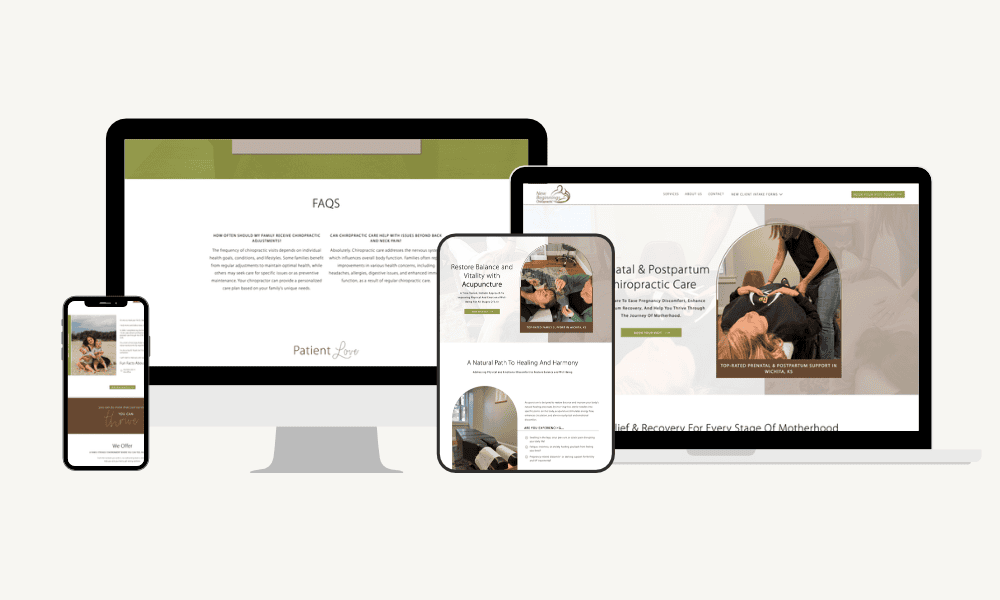
When I worked on New Beginnings Chiropractic in Wichita, the services lacked dedicated pages. Now someone looking for pregnancy and postpartum care can go straight to that page, while a parent looking for infant or pediatric care has a page of their own to explore. See how New Beginnings Chiropractic organizes its services.
On each service page, explain who it’s for, why someone might need it, what to expect, and how to book or get in touch. Use the words your customers would actually type into Google.
This is where website design and SEO work together. I plan the pages around what customers need to know, and SEO helps those pages become easier to discover. Explore Get Found, my ongoing SEO service.
4. An About page that helps people decide whether you’re a fit
Your experience matters most when people understand what it means for them. A family photographer can explain how she works with kids who need time to warm up. A cleaning company can introduce the team and explain who will show up for the appointment.
Share the relevant credentials, a real photo if you have one, and a little about how you work. Give people a sense of who they’ll be dealing with once they reach out.
5. Contact details people can find quickly
If customers visit you, make your address, phone number, and hours easy to find. Put the basics in the footer and give people a directions link on your contact page. One of the things I flagged at New Beginnings Chiropractic was how hard it was to get directions from the site. That matters when someone is already on their way to an appointment.
If you travel to customers, list the areas you serve and tell people how to check whether you cover their address. If you work entirely online, give people a clear contact or booking option. For local businesses, check that any hours and public address you list match your Google Business Profile.
6. Navigation that gives each page a job
Use menu labels people already recognize, such as Services, About, and Contact. The homepage can introduce what you offer and point people to the right service page. The service page can answer their questions and send them to booking or an inquiry form.
Try following that path yourself, starting on a service page instead of the homepage. Can you tell where you are, what the business does, and how to take the next step? Someone who finds that page through search may start right there.
7. Copy that answers the questions customers actually ask
Think about the last few calls or inquiries you received. Did people ask how far you travel, what’s included, or how to prepare for their first visit? Those questions tell you what belongs on the site.
A cleaner can spell out what’s included in a deep clean and whether the team brings supplies. A photographer can explain what happens if it rains on the day of an outdoor shoot. Put the answers on the relevant service page so people can use them while they’re deciding.
8. A design that works on a phone
Readable text, clear headings, and consistent buttons make the page easier to scan. Once the layout is in place, try booking or requesting a quote on an actual phone. Tap the phone number, open directions, and submit a test inquiry. Pay attention to tiny buttons, fields that are hard to fill out, and anything you have to zoom in to read.
9. Search and performance basics
Give each important page a descriptive title, a clear main heading, and a short description that accurately reflects the page. Link to related pages using words that tell readers where they’re going. Use photos sized for the web, check how quickly the pages load on your phone, and confirm the site uses HTTPS.
Start with your homepage and the services people are most likely to search for by name. A page called “Deep Cleaning in [City]” tells readers more than a page called “What We Do.” Use that specificity where it accurately describes your business.
10. Proof near the decisions it supports
Put relevant reviews, work samples, or credentials where they answer a question a customer might have. A photographer can show a gallery on the family sessions page. A cleaning company can share a review about its move out service next to the quote button for that service.
If you have a testimonial that speaks to a specific concern, use it where that concern comes up. A review about how you handled a nervous child tells a parent something they can use when deciding whether to book.
Where I’d start if you already have a website
Open your homepage on your phone and read the first screen as if you found the business through a Google search. Then pick one main service and try to go from learning about it to booking or requesting a quote. Write down the first place you hesitate. That’s the first thing I’d fix.
If you find yourself rewriting the homepage, untangling the service pages, and rethinking how people book, it may be time to look at how the whole site fits together. See how I plan and build custom Showit websites.
Your Website Could Be Working Harder for You.
You’ve built a business worth showing off. Let’s give it a website that looks the part and helps people take the next step.